No matter how good your organisation’s diversity data is, it’s only the starting point of a diversity management roadmap. When Diversity Atlas works with organisations to turn the insights into their diverse workforce into better diversity management, the goal is to help them become what we call diversity agile.
The diversity agile approach came about because I worked in the health sector for over a decade. Back then we had a problem: the health sector workforce did not match very well the diversity of the community. (In fact, it’s a problem we still have.)
This mismatch was a problem because there was a lot of evidence that people’s health outcomes shot up dramatically when the cultural diversity of doctors, nurses and other health professionals more closely matched the diversity of the community. It had all kinds of positive effects, like better trust between medical staff and patients, reduced visits to emergency rooms and overall better long term health.
To help guide my thinking on approaching this problem, I started using the word “mutuality” to describe the match between the diversity of an organisation (such as a hospital) and the diversity of the community. I chose this word instead of, say, “representation”, because mutuality highlighted the mutual benefits of a diverse workforce for both community and service providers. This work ultimately led to the development of a world-first set of Standards for Workforce Mutuality, which were launched in 2018 and are being adopted across the health and community sector.
Fast forward to 2019, when I joined the Diversity Atlas team at Cultural Infusion. We realised straight away that the concept of mutuality could be a powerful tool for helping our clients—which include corporates, government departments, education providers and more—to build more inclusive, harmonious and innovative workplaces for a diverse workforce.
From this insight we developed the diversity agile approach. Put simply, if an organisation wishes to leverage the benefits of a highly diverse workforce, it needs to become competent across the three dimensions of diversity, mutuality and inclusion. When an organisation achieves this, it becomes diversity agile.
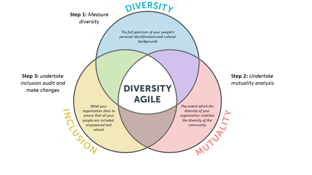
To explain what I mean, let’s look a bit closer at this diversity agile diagram:

As you can see it’s a Venn diagram: each of the three large interlocking circles represents the work an organisation can do in the space of diversity, mutuality and inclusion. Where the circles overlap, it means that an organisation is doing work in more than one of these dimensions. For instance, the brown petal-shaped overlap at the bottom of the diagram between inclusion and mutuality means there is work being done in mutuality and inclusion (I’m sure you get the idea).
What we’re saying is that an organisation becomes more diversity agile when it works across all three dimensions at once—that is, diversity and mutuality and inclusion. In the diagram, that’s the white triangular area at the centre with the—ahem—big letters saying “diversity agile.”
To show how being diversity agile is better than working in just one or two dimensions, let’s look at what you get when you restrict yourself to one of those overlapping “petals” in the diagram.
Let’s start with the green petal, at the top left of the diagram. This represents an organisation that is working across diversity and inclusion. Not a bad place to be. It means that you have a diverse workforce, and that your organisation has made efforts to be inclusive of all its people. However there’s no mutuality, which means that your organisation doesn’t represent the broader community. There’s a danger, then, that the diversity in your organisation is tokenistic or out of touch with the community.
Now let’s look at the purple petal in the top right. This represents diversity and mutuality, but no inclusion. An organisation like this would have gone to some effort to build a diverse workforce that is fully representative of the community (that’s the diversity and mutuality covered), but then done nothing to support its staff. This is a recipe for disaster, obviously.
Finally we have the brown petal at the bottom, which represents mutuality and inclusion, but no diversity. This is a funny one to interpret. This type of organisation would have no diversity among its workforce—everyone would have the same cultural background, but because there is also mutuality, this workforce would represent one particular community.
I can think of some real world examples of this kind of organisation. It would make sense, for instance, for an Aboriginal community-controlled health organisation to have most of its staff being Aboriginal. But in general the combination of mutuality and inclusion but no diversity wouldn’t help organisations who aim to work with a broader cross-section of the community.
You can see now how being diversity agile is a better choice for organisations. It seems like a no brainer, but of course it’s much harder to achieve in reality. One of the major questions we get at Diversity Atlas when partnering with organisations is: okay, but what am I supposed to do with this information on my organisation’s diversity profile?
The answer lies in the Diversity Agile approach I’ve outlined here. Diversity data isn’t ever the end goal for diversity management—it’s a starting point on a roadmap to creating and succeeding with a diverse workforce. At Diversity Atlas, we think that the diversity agile approach is the gold standard for good diversity management.
Diversity Atlas is a data analysis tool for measuring diversity in your workforce. It’s designed to inform diversity management strategies for businesses and organisations to thrive in a globalised world. Get in touch for a consultation via info@diversityatlas.com.au
Share this Post