Benchmark your Diversity Profile and Inclusion Sentiment against organisations in your industry and region.
This matters because from both the competition for talent attraction and the battle for talent retention, we can draw a straight line to sentiment, productivity and profits. Looking at a set of comprehensive diversity data tells a story (with many chapters) but being able to compare and contrast your data against other organisations in your region or industry is paramount to contextualising your story.
The same premise applies internally; to be able to benchmark business units and offices against each other will enable real-world action. With this information, workplace change can be made more meaningful, bespoke… targeted. With the purchase of a Diversity Atlas license, the benchmarking data is loaded up on to your live dashboard. The data is collated by anonymously aggregating the results of our global customers.
The diversity benchmarking is split into two main categories.
External Industry Benchmarking
Internal Diversity Benchmarking
There are 21 diversity benchmarking options to choose from, ranging from demographic percentages (eg: percentage of staff born in the host country), ‘Prefer not to Answer’ figures (eg: percentage of staff who did not answer the ‘sexuality’ question) and even sentiment (percentage of staff who believe their organisation is inclusive).
Below are some ‘live’ examples of diversity benchmarking we have collated.
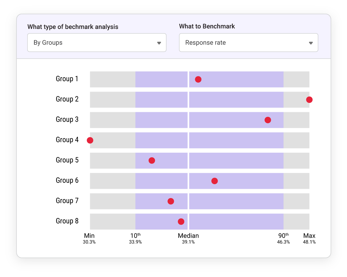
Internal Diversity Benchmarking
The more the merrier on this benchmark! The response rate on a diversity survey is a clear indication of engagement, and perhaps even trust in the organisation and its chosen platform. We see above the participation rate by percentage for each of this organisation’s groups (eg: region or business units).
Providing the whole cohort with live benchmarking whilst the survey is still active also encourages some healthy competition between the groups.
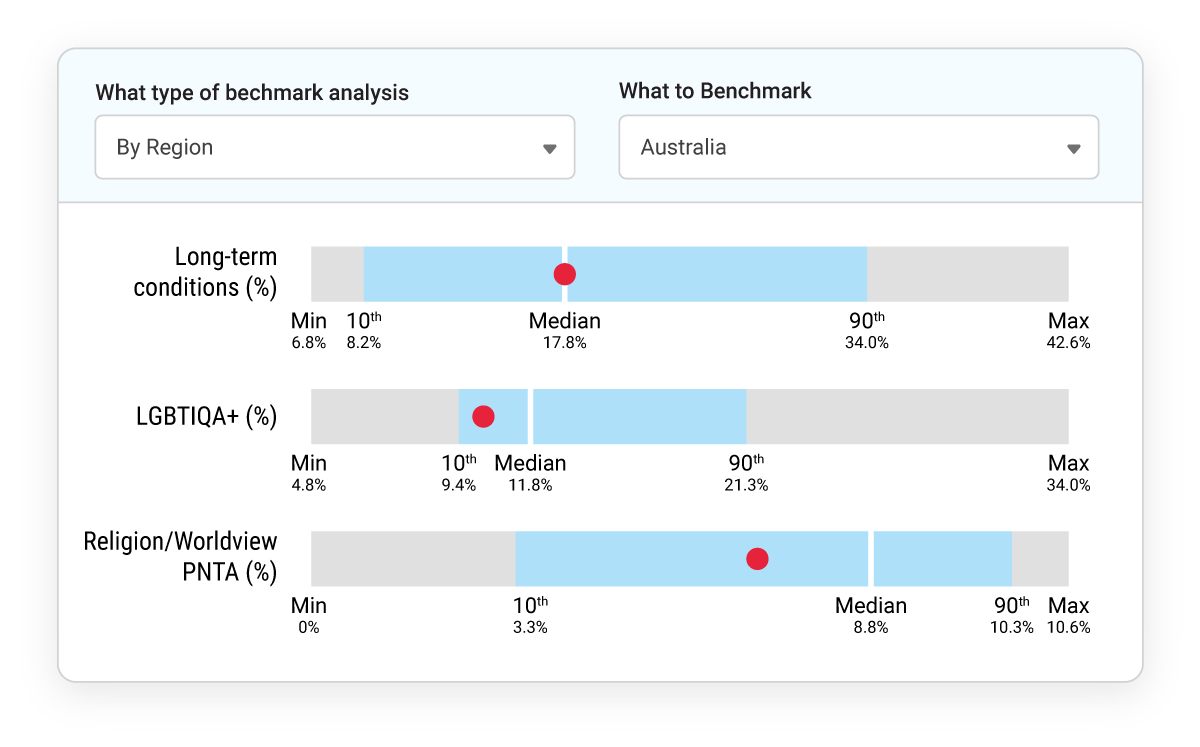
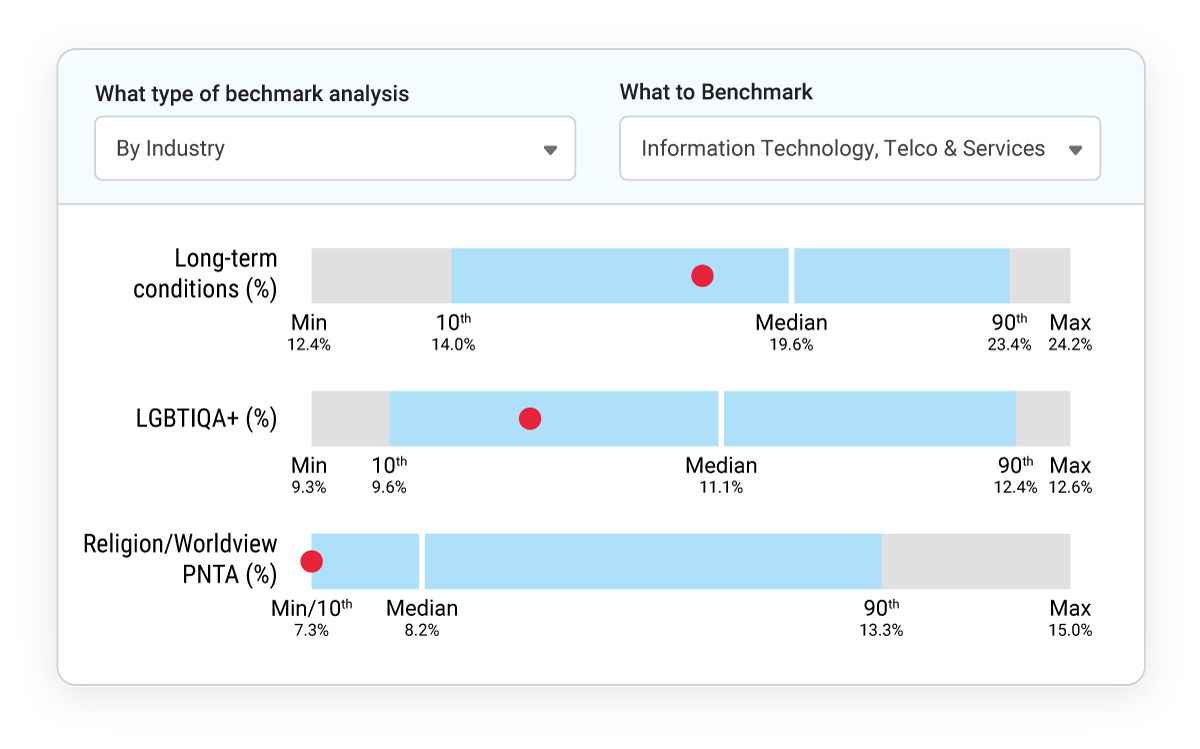
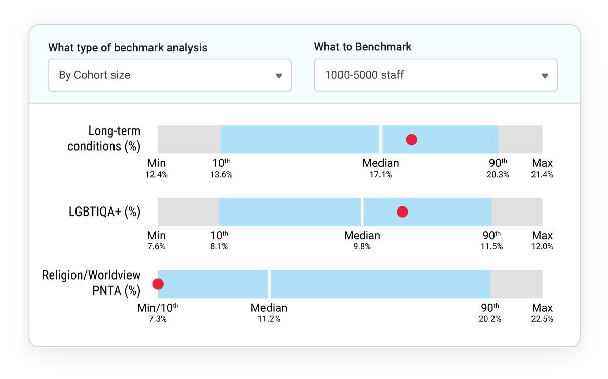
External Diversity Benchmarking
To the left we will look at three of our 21 benchmarks, across three search queries (industry, region and cohort-size).
Some benchmarks are simple to quantify but harder to qualify. Here we see the percentage of staff who identified as living with Long Term Conditions (which we define as any condition that affects interactions and includes disabilities and medical conditions), as well as those who identity as LGBTIQA+.
But what’s the best figure? If one company is at 8% and another at 6%, does that make either company better than the other? The best answer is to look for patterns and anomalies with the diversity benchmarking, and also track the results against internal diversity benchmarking, sentiment figures and the levels at which other companies are tracking. This should then inform the next step… what to do with the information.
It should also be noted that we believe people who live with disability and / or identify as LGBTIQA+ are often more likely to complete a DEI survey, for reasons that are well documented in DEI literature.
‘Prefer not to Answer’ (PNTA) is an answer in and of itself. It implies there is an answer, but the participant is uncomfortable offering one. When we look at diversity benchmarking figures both internal and external we look for patterns and anomalies in the data.
If one group has a high ‘Prefer not to Answer’ for sexuality but a low ‘Prefer not to Answer’ figure for Religion / Worldview, it tells a story of (perhaps) a relative lack of cultural safety around sexuality identities in that organisation; but another group or company with the opposite result might need to look into accommodations and awareness around the topic of religiosity.